Monday, June 27, 2016

Mushroom Fairy 01

I'm starting a new page of coloring this week.  I've chosen the Mushroom Fairy from my Enchanted Coloring Book Series - Enchanted Garden. She's one of my favorite images from the book.
One of the things I wanted to make sure to mention, is that coloring should just be FUN & RELAXING. It's not a contest. It's not even how good it looks when you're finished. It's all about whether or not you had a good time while you did it.

Personally, I like to take my coloring out to my back yard, sit in the shade, listen to the birds and have all the worries of the day just go away.

As with all my art work, including my oil paintings, I start with a really light background color. It's basically a watercolor technique that I learned decades ago. I've incorporated it into all my art.

First, I think that it helps to overcome that initial fear of .. "OMG, look at all that white space!!"

And Second, If you start light and don't like it, you can always color/paint over it.

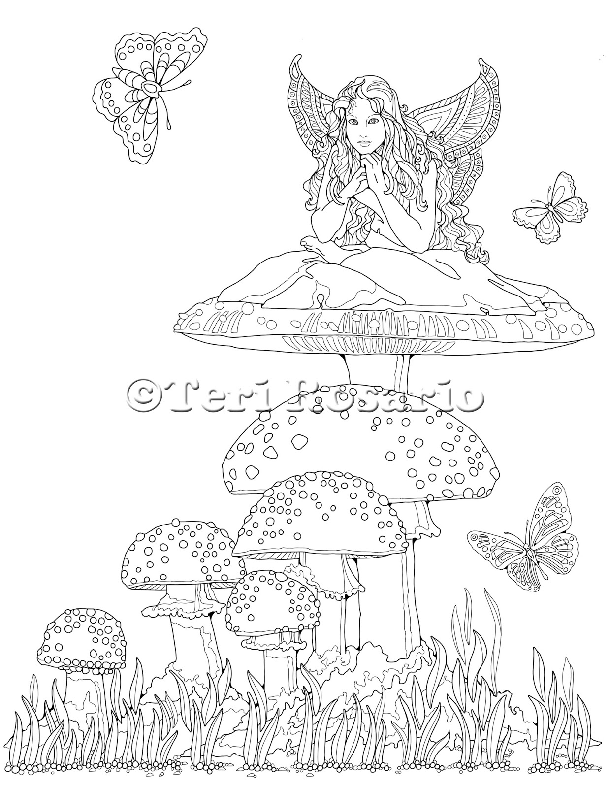
So, I started with a Prismacolor #1011 - Deco Yellow for the mushroom caps. I'm going to go with the natural color of these mushrooms, which is red. The yellow will eventually become the highlights.

You can see in the picture above that I'm using a Koh-I-Noor Pencil holder. It allows you to use your pencils all the way down to the nub, without getting a cramp in your hand.


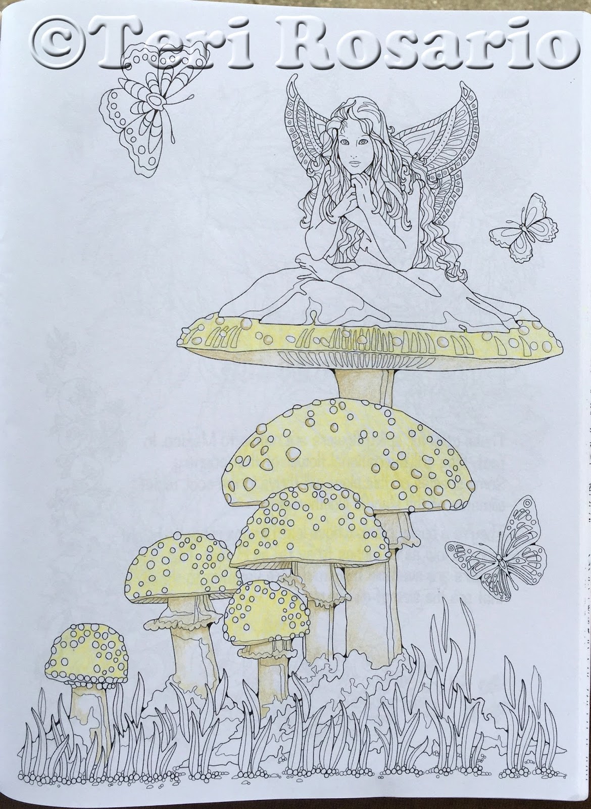
Next I chose a PC1084 Ginger Root for the base color of the mushroom stems. I used really light stokes with this pencil, except where I felt there would be shadows. (I've chosen to have my light source come from the upper right).


Then I used a Burnt Ochre PC943 for the base color of the dirt below the mushrooms. Again with just light strokes.  I also added a bit of this color to the shadow side of the mushroom stems and under the caps.


Finally, I chose Apple Green PC912 for the base color of the grass.

Since I have NO idea what colors I want the fairy to be I think I'll save her until the mushrooms are in and see what I think will work best at that time.

Thanks so much for watching.
Don't forget to join me on Facebook for sneak peeks into the next Enchanted Coloring Book, Enchanted Sea.

Until next week! Happy Coloring!

Monday, June 20, 2016

Garden Gate 09 Finished!!

As promised, I'm finishing this one up this week.  Here's where I left off last week.

Now on to the moon.


I started with a Cool Grey 30% PC1061. I really wasn't sure about this at first so I used a really light stroke, off in one small section. It did look right, so using the same light stroke, I colored in the whole moon.

Over that I added a bit of Slate Grey PC936 very lightly on the edges to give it that 3D feel.

I added a bit of Cloud Blue PC1025, very lightly, over the whole moon. It had started to look too grey. And the Cloud Blue helped to take the grey down a bit.

Finally I used PC933 Violet Blue all along the edges and filled in the "tips" to enhance the blue even more.


I debated for a long time about the star. In the end, I decided to leave it white.

I added a bit of PC 933 Violet Blue to all the rocks. It helps to bring the colors used in the moon into the whole piece.


Then I used a bit of an illustrators trick and added black lines to the shadow side of all the leaves and grass. It makes them pop off the page.
So here it is finished! 
A lot of folks use methods to blend the pencils and get rid of the "white specks". I don't. I actually like the specks. I think that it helps the depth of the piece. However, if you want to blend them some more, Prismacolor has a blending pencil that you can try. I've tried it, and it helps but not a lot. I've also heard that folks use a bit of vaseline over the pencil. But I have not idea how that is done. I'm sure you can Google it and find out.

 Once I'm happy with a piece, I spray it with a workable fixative.  It keeps the pencil from flacking and making a mess as time goes on.

I use Krylon Workable Fixatif (not a typo). It protects pencil, pastel & chalk drawings from smudging and wrinkling.  It comes in an aresol can. Be sure to spray it outside.

Thanks so much for watching this process. I hope that some of the tips, tricks and hints have helped.

Next week, we'll start on something new!  The Mushroom Fairy from my Enchanted Garden coloring book!

Have a great week! Happy Coloring!

Monday, June 13, 2016

Garden Gate 08

Happy Monday Everyone!
We've been having record high temps here in Nebraska. So, I've had a lot of indoor time which means a lot of coloring time. Yay!!

Without further ado ...
Last week, I finished up with coloring the background of the door's center medallion.

Because I wasn't too sure, yet, what to do with the moon ....
I looked at the door itself, in comparison to the green in the medallion and thought that it needed to get a bit darker.

Using a PC908 Dark Green,  I added a bit of that to the door. Here's a side by side view of the before and after. It's not a lot of difference but I think that it helps to add a bit of depth and realism to the door. If nothing else, I it adds some more interest.

Don't be afraid to layer as many colors as you like. 
They add more richness to your coloring. 
Once the door had it's additional layer, the rock wall was looking a bit flat in comparison. So with my handy PC935 Black, I darkened up the crevices in the wall. Again, the difference is minor, but I think that it was worth the effort. In my humble opinion, it helps the rocks to pop off the page. (On your computer, you should be able to click on the image for a larger view.)
Finally I used Sienna Brown PC945 and Dark Umber 947 to add color to the pebbles at the bottom. Use the lighter color to fill them in completely, then the darker color to add the shadows on the underside of the pebbles. 

Something I tell my students all the time 
-- Good art takes time! --
Speed isn't something you should be trying to achieve with art. It's not a race! Especially not with coloring. Slow down. Have fun!

That's it for this week. Hope some of the hints helped.
See you here next week, when I think I may have this finished! Don't forget to join me on Facebook, where you can see sneak peeks of my next book in this series. 

Happy Coloring,
Teri


Monday, June 6, 2016

Garden Gate 07


Last week, I started the center medallion in the door. Here's what it looked like.

Then I added a little bit of Sunburst Yellow PC917, along with just a touch of Pale Vermillion PC921.


Both of those colors really helped the sun to glow, I think. They also started to add that 3 dimensional look.


Remember, layering the colors, whether you're working in pencil, watercolor or oils, help to add depth to your work.


It took me quite a bit of time to figure out what color to put behind the sun. I was sure at all... ~so~ ... I took a piece of scratch paper and tried out a few colors on that first. 


Scribble a bit of the color on the side of a piece of paper. Fold the paper up so that the color is right on the edge. Then hold it up to your work.  This way you can really see if it works with the rest of what you already have.

I started with a Grass Green PC909.  Once that was in place, I thought that it all could be a bit darker. So I went over it with Dark Green PC 909. That made me happy! 

As with all the other sections, a bit more depth was called for.


Using Indigo Blue PC901, I added a shadow live close to the edge of the sun rays. This helped to pop out the Sun even more.


Finally, I decided that the whole green section was a bit bright and "in your face" in comparison to the rest of the piece.  So with a Dark Brown PC946, and a very light stoke, I went over the whole green section. This is the final result.

Thanks so much for spending some time with me. 
And I'll see you here again next week.