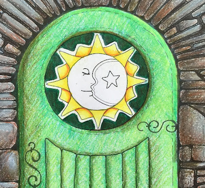
Last week, I started the center medallion in the door. Here's what it looked like.
Then I added a little bit of Sunburst Yellow PC917, along with just a touch of Pale Vermillion PC921.
Both of those colors really helped the sun to glow, I think. They also started to add that 3 dimensional look.
Remember, layering the colors, whether you're working in pencil, watercolor or oils, help to add depth to your work.
It took me quite a bit of time to figure out what color to put behind the sun. I was sure at all... ~so~ ... I took a piece of scratch paper and tried out a few colors on that first.
Scribble a bit of the color on the side of a piece of paper. Fold the paper up so that the color is right on the edge. Then hold it up to your work. This way you can really see if it works with the rest of what you already have.
 I started with a Grass Green PC909. Once that was in place, I thought that it all could be a bit darker. So I went over it with Dark Green PC 909. That made me happy!
As with all the other sections, a bit more depth was called for.
Using Indigo Blue PC901, I added a shadow live close to the edge of the sun rays. This helped to pop out the Sun even more.
Finally, I decided that the whole green section was a bit bright and "in your face" in comparison to the rest of the piece. So with a Dark Brown PC946, and a very light stoke, I went over the whole green section. This is the final result.
Thanks so much for spending some time with me.
And I'll see you here again next week.


No comments:
Post a Comment