Monday, August 22, 2016

Enchanted Garden Peek

Before I move on to coloring another page, I thought that I would show you some of the pages that you will find inside the Enchanted Garden
(I will be producing my own completed video view in the next few weeks - as soon as I figure out all the technical aspects.)

The book starts with the Garden Gate. 
(Please note that the copyright seen on these images, does NOT appear in the coloring book.) 
Here's what it looks like blank and what it looks like colored.


This is Amaryllis. What you see here is the coloring page (that's on the right)  and the description page (on the left) which is the facing page in the book.

One of my personal favorites is the Bird of Paradise page.

These, of course, are Daffodils. I think that this is the page I might be coloring next.

What Garden themed book would be complete without Roses.
I did spend some wonderful, quiet time coloring this page. I did this one just for fun. Sorry there's no tutorial for it.


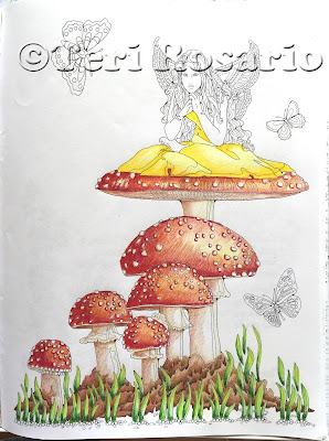
And finally, here's the Mushroom Fairy page, along with it's facing page. 

And the finished colored version.

The book is 8.5 inches x 11 inches. It's printed on a medium weight, 60 lb., bright white paper.
There are 48 coloring pages within the book. Along with pages of interesting & unique facts about the flowers.
You can purchase the Enchanted Garden on Amazon today for $ 11.95

Thanks so much!
Happy Coloring!


Monday, August 15, 2016

Mushroom Fairy Finale!!

Yep, I'm going to finish her today.  Here's where I started this week.

So, of course, it's the butterflies that are next. 
I didn't think that I should introduce any new colors to this piece.  I was, however, a little nervous that more of the yellow, orange and red might be boring. But, I decided to go with my first instinct.

I started with Deco Yellow PC 1011. Since they are all going to be similar in color, I used it on all three butterflies.

Then I chose PC 942 Yellow Ochre, followed by PC 1032 Pumpkin Orange. Since the spaces are so very small, I made sure to sharpen my pencils often.

PC 924 Crimson Red came next. I really liked the look of that bottom butterfly. Because the Crimson Red filled in the wings, the butterfly picked up the color of the mushrooms.

Since I liked the effect of that bottom butterfly, I decided that the top butterfly should pick up the color of the fairy's dress. Using PC 915 Lemon Yellow, I filled in the wings.

Now for the bodies of the butterflies and to do some outlining to make things pop. Using PC 935 Black, I filled in the bodies first. Then, very carefully, I started to enhance the some of the outline of each of the butterflies. 
I don't do the complete outline. If you just do a small portion, usually on the shadow side, it works best to make the objects in the image pop.

I did the same thing with the fairy.
I outlined her wings and then brought the outline right down her left side. 

At this point, I decided that I wanted a little bit of a glow in the background. So I had to stop with the outlining. If you have dark colors already on the paper, and you want to add a light color next to it, you have to be especially careful not to run the light colored pencil in to the dark area. It will smear!!

With PC 914 Creme, I carefully added some color to the lower section of the image.

Once I started looking at the lower section of the image, I realized that I hadn't done anything with the pebbles at the bottom. Yikes!  So with a Sienna Brown PC 945 I filled them in. Then added a light stroke of PC 1017 Clay Rose to the space between the dirt and the pebbles. Once that was done, I used PC 915 Lemon Yellow and added that to the "glow" in the background.

Now back to the outlining. I worked the line throughout the shadow side of each of the mushrooms, the underside and their stems. I think you can see just how much of a difference it makes in giving the mushrooms a 3D sort of look. 
Once I finished the outlining, I thought that I was done. As I was sitting admiring my handiwork, I started to feel that her hair was just a bit dull and boring. So with Mulberry PC 995 and Violet Blue PC 933, I added a bit more color.  

Now It's Finished.


Thanks so much for following along as I colored!
Next week, I'll start on something new. If you have a favorite from my Enchanted Garden Coloring Book that you would like me to color, let me know. 
Until then, follow along with me on FB as I show you sneak peeks of my next Coloring Book "Enchanted Sea"
Happy Coloring!!


Monday, August 8, 2016

Mushroom Fairy 07

With the skin tones complete, we're now onto hair and wings.  Since I really want the fairy to stand out as the item of focus, I've decided that her hair should be black. It's not the easiest hair color to create. But here goes. Here she is as we left her last week.

I started with a Cool Grey 30% PC 1061. With light strokes I added that color throughout. This will end up being the highlight areas. 

Then with a Cool Grey 70% PC 1065, I started to color in some of the sections of her hair. As I did this I kept in mind where I thought the shadows would start. 

I moved on to a Warm Grey 70% PC 1056, coloring in additional sections that would be in deeper shadows. Also I added some of this color to some of the sections that were in the lightest color.

At this point I thought that I was loosing some of the definition in her hair. It looked to me like it was just going to be a big mass of grey. Not what I wanted.  So using Black PC 935, I traced back in some of the original lines, so that they could be seen better. 

Now I was able to darken some of the sections even more. I used Cool Grey 70% PC 1065 and worked that in a lot of the hair. 

Then back to the Black PC 935 to bring out more of the definition of her locks.

I'm not sure that I'm finished with her hair just yet. It's okay, just not great. But I think I'll move on to other things right now. First though, I thought she needed just a little more shadow to her skin tones. I used Sienna Brown PC 945. I added just a little in all the shadowed areas of her skin.

Now for her wings. 
I decided that I didn't want her wings to take focus, but I did want them to be pretty. I chose to create them with all the colors that I've used in the mushrooms & her dress. I added Deco Yellow PC 1011 and Sunburst Yellow PC 917 first.

Then a Pale Vermillion PC 921 & Mulberry PC 995.

Then back again with the Pale Vermillion, because I thought another different color would have been too busy. I added a little bit of shadow to the area of her wings closest to her body. 


Just before putting down my pencils for the day, I added just a bit of the Pale Vermillion to the right side of the large mushroom. It was looking a little dull. :-)
All we have left to do are the butterflies. I honestly don't know what I'm going to do with them.  I don't want to introduce a new color. But will it be too boring if I stay in the red & orange colors?? hmm....

Thanks so much!!
Happy Coloring!


Monday, August 1, 2016

Mushroom Fairy 06

So, as I promised last week, I'll be doing skin tone today.
Here she is, close up and blank.

The best piece of advice that I can give about skin tones is to make your stokes VERY light to begin with. You can always go back and add color, but with colored pencils, you can't take away color.

I started the process with PC 914 Cream.  It's a nice pale color and fills in the white space nicely. This way the white isn't so intimidating.

Then I used a Light Peach PC 927. Pretty much added that color all over the skin area. Leaving just a little of the Cream color showing on her arm on the right side of the image.

Then I thought I needed to add some shadows. With PC 1080 Beige Sienna, I figured out where the shadows would be (left side of her arms and face - under her hair on her forehead - the underside of her foot.)  and very gently added this color a little at a time.
I thought she looked very sallow after the addition of that last color. So, I pinked her up a little with PC 928 Blush Pink. I added the color to her checks and to her lips, but also just a tiny bit in some of the shadow areas. Following that, I used the Cream PC 914, very lightly, all over the skin areas to blend the colors together a little.


Now back to her face. She needs a bit more definition, a bit more interest. I used a PC 943 Burnt Ochre to add more color to the sides of her face, the area around her eyes and the small area right under her bottom lip. 

If you have questions about where the shadows are on a face, go to a mirror and take a look at your own face. It really does help.

I then went back and forth between the Cream and the Blush Pink, blending the colors in on her face and arms. Then with a little bit of PC 929 Pink & PC 923 Scarlett Love, I colored in her lips.

Finishing off her face, I used PC 1024 Blue Slate for her eyes.

I'm going to stop at this point. If you have any questions please don't hesitate to ask. 
Thanks so much for "watching" and for all your support.
Happy Coloring!

Monday, July 25, 2016

Mushroom Fairy 05


This is where we start this week. I'm finally going to work on the fairy!


I decided that her colors needed to coordinate with the mushrooms. Not be the same, but not be opposed either. So, I've chosen to go with a gold!

To begin the process, I started with a color that would eventually become the highlights of her dress.

This is the same progression of colors that I start with all the time. The lightest possible tone of the color goes first.

I used a PC 915 Lemon Yellow, with a light stroke all over.


Now I can start to add some darker colors, which will bring the dress to life.

Using a Canary Yellow PC 916, I started to add more color into the areas that are more shadowed.


Then I picked up Sunburst Yellow PC 917 and filled in more color.  I make sure to leave the highlight areas alone. They still only have the lightest color, the Lemon Yellow that I started with.


Keeping this layering going, I added Goldenrod PC 1034.

Because these are all lighter colors, and the end result I'm looking for is a "glowing" gown, all the color additions I've done have been done in a very light stroke.


At this point I needed a little more shadow in some of the areas. So with a PC 945 Sienna Brown, I added a little more shadow in the areas that I felt were in the deepest shadow.


Here's a closeup view. You can see how all the colors have come together to create a nice glowing gown.


To complete the look, I decided that the belt should match the color of the mushroom tops.  Even though it's a very small section, I used the same process, working from light to dark.
I used the following to create the belt --
First --
PC 921 Pale Vermillion
then --
PC 924 Crimson Red
followed by --
PC 1009 Dahlia Purple
and a little --
PC Black Cherry in the deep corners.

Okay, here's where we stop this week.
I really like the way the gold in the dress stands out over the red in the mushrooms.  It also helps to bring out the highlights in the mushroom caps.

Next week, flesh tones!!

Happy coloring.