Tuesday, May 31, 2016

Garden Gate 06


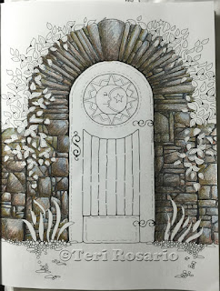
Here's the last image from last week. I warned you that the green of the door might not be finished yet. Well, I was right. I did some more work on it. Here's how it went.


I started the transformation with a Marine Green (PC988). I added some shadows to the areas on the left of the door. I also used it to add some definition to the boards in the lower center of the door and around the inner, right area of the circle medallion. It's starting to not look so very flat already.


Then I picked up PC 1004 a Yellow Chartreuse. I used this to add some warm highlights to the rest of the door. And to knock down the aqua color that I had put in first.

Moving along, I added some Olive Green (PC 911) to the bottom of the door to make it a bit dirtier. Which, I figured would make it look more real.

Finally, I chose a color called Chocolate (PC 1082) because I thought that the greens needed a bit of a toning down. I used it with a light stroke over all of the shadow areas.
Layering colors helps to give you more depth and interest. 
Things don't look so flat. 

Now it's time to finally start on the center Medallion!!   
As with everything else, I'm combining colors. I started with Lemon Yellow (PC 915). I used a light stroke and filled in all the sun rays with it.  Then I used Canary Yellow (PC 916) to add a little more depth. Then finally added a Yellow Ochre (PC 942). But I only used that on the small rays that are behind those larger rays. I used it only on the lower edge of them. 

Alright, I think that's all for this week. Thanks so much for watching. I hope that at least some of the tips have been helpful.
Be sure to look in next week as I figure out what the rest of this medallion looks like.
Help to spread the word. Please share this with any one you think might be interested.
Bright Blessings,
Teri

Monday, May 23, 2016

Garden Gate 05


This is the last image you saw in the Garden Gate 04 post.

I promised to work on the door next.

Well, I did.


However, when I added the first color, I pretty much freaked out. I didn't like it at all. Which was very unfortunate, since all along I had been visualizing the door as a teal color.  Once I put it down on paper though, it clashed with the greens of the leaves. So, I kept working until I got to a place where the color didn't look terrible.  I got so involved in the coloring, that I didn't take pictures after adding each new color. In my frenzy, I did however, manage to write down the names of the pencils that I used.


First I used the Yellow (Light) Chartreuse   PC 1004 for the leaves. It gives them a bit of punch.

Then I started the door with the Light Aqua PC 992. I used very light strokes. Once it was down on paper I kinda knew that it was wrong.


I tried to correct it with a Cool Grey PC 1061. Trying to knock down the color a bit.  Hmmm.... I liked that even less.  So, back in I went with Deco Aqua PC 1016.

At this point, I realized that the blue tones in the teal colors were clashing with the yellow green tones of the leaves.I gave up on the teal idea and decided the door wanted to be  green.

So, I used a combination of Parrot Green PC 1006, Spring Green PC 913, and Grass Green 909.  That got me to this point!

Finally I took the Grass Green and added some of it to the darker areas of the leaves & grass.

I know that the door isn't finished yet, but I'm not sure where it's going to go next.

Thanks for watching! And wish me luck on finishing the door color!

Monday, May 16, 2016

Garden Gate 04

Last week I ended with this image. I said that I thought the stone walls were finished. Well ... the more that I looked at it, the more I thought that it was a bit too dark. I also thought that there really wasn't enough color. It is an Enchanted Garden after all.

So I picked up my Burnt Ochre (PC 943) again and added some of that color all through the rocks. I did make sure to not add any color to the upper right hand section of the rocks. This way the direction of the light (from the upper right) is still evident in the image.
I like this a whole lot better! Don't you?

Now onto the leaves.  Woohoo!

As with the stone wall, I started with a really light green for the base color. In my set of Prismacolor Soft Core Pencils the color is called Chartreuse. The number is PC 989. I chose this color because it has a lot of yellow in it, which will be great for the highlights of the leaves. It'll also help to brighten things up.

Sorry about the picture quality. I was on vacation. Taking pictures in a hotel room is sorta difficult. The light quality is really poor.  However, I did want to take a picture before I used the next color.

Then I went in with a Grass Green (PC 909). As you can see I made sure to keep this color to the lower sections of the leaves. Leaving the lighter green to show through at the top.

I'm pretty sure I'm not finished with the different color greens for the leaves and the grass, but that's it for right now.

Oh, I also colored in the little stars that are hiding in the leaves. I used Lemon Yellow (PC 915).


Next week .... The Door!!

Thanks for listening. And spread the word to anyone you think would enjoy this process.

Happy Coloring!
Teri

Monday, May 9, 2016

Garden Gate 03

Here's where I left off last week. I hope that some of the info has been helpful. Now on to some more fun stuff and additional colors.


At this point I thought I needed to darken up the rocks a bit more. I didn't want to use another brown or gray color, so I chose a color called Green Ochre.  In the Prismacolor soft core pencils, it's number is PC1091. I added it in the places that would be in shadow. I think it now has more depth.

But now it looks a bit dark and dirty. Don't you think? Yep, me too.


So I picked up PC1054, which is called a 50% Warm Gray and added that on top of the previous color to knock it down a bit. Once I got that color on I decided that the rocks lacked a bit of magic. So back to the Periwinkle I went and added a bit of that into some the highlight areas.


Finally, I want back to the Dark Umber to add some more shadows. I added most of those along the edge of the rocks close to the right side of the door. It gives it more dimension. I also used the Burnt Ochre again in the places that I wanted more shadow, but not as dark as what I would get with the Dark Umber.

Okay!! I think the rocks are done. Well, at least for now they are. Next week we can start on the leaves and maybe even the door.  I'm not sure at all what color the door should be.  What would be your choice?

Monday, May 2, 2016

Garden Gate 02

Here's where we left off last week.
Started with a Pale Grey Color for the overall background. Then added a Dark Umber to the crevices between the rocks.

Now I'm going to start layering in some more color. Here's where the fun really begins.

At this point, before you start to add more color, you should decide where your LIGHT is coming from. I've decided that my light source is coming from the upper right corner of the illustration.

Defining your light source will help you as your coloring goes on. You'll know where your highlights (lighter colors) and your shadows (darker colors) should be. This will help your page look more 3 dimensional (more real).


I've chosen to start adding color with a Burnt Ochre (Prismacolor 943). Since my pencil strokes for the Pale Gray layer were from right to left. I switched this layer up and went up and down. What the change in stroke direction does is help to fill in the layers of color. You'll have less "white spaces" if you change the direction of your strokes as you go along.
You'll also notice that I've started to define the highlight and shadow areas.


In this next picture you'll see that I've added two more colors, Periwinkle (PC1025) and then a Dark Umber (PC947).  Why Periwinkle, you might ask? Well, as I look at some rocks, I see a bit of blue in them. So I thought I'd try it.

You have to remember, this is supposed to be fun. So don't worry too much about making it "perfect". Honestly, it's just paper. If you don't like it, color over it. If you still don't like it, move to a different page and start something else.

I have to be honest, when I finished adding the Periwinkle, I wasn't terribly happy with the look. ~Sooo~, I picked up the Dark Umber and most of the Periwinkle disappeared. The Dark Umber also has started to really define the shadows in the rocks. They are starting to look rounded!

Okay, that's it for this week. If you have any questions don't hesitate to put them in the comments below. I'll get to them as quickly as possible. Any comments would be appreciated too.
Don't forget to click like in the "Google+1" box, to help spread the word.
Thanks!